Friday, December 28, 2012

Christmas Week - Painting at Leonesse


We just got back from our annual Christmas trek to California to share the holiday with the kids and grand kids  It was prefaced by a major prep effort. I had to pack the car with my oils, some boards to paint on, turps, brushes, paints, paper towels and all the accouterments of a plein air painting day. Oh yeah, there were gifts going in the car too.  And fudge. Don’t forget the fudge. Underwear you can always buy….good fudge is harder to find. 

Looking East from Leonesse's atrium. Friend Irina is painting.
I also had to call the winery ahead of time to set up a paint day for us. It’s really important to always get permission to paint on anyone’s grounds ahead of time. As artists we tend to find out of the way areas to paint where we are not underfoot, and where traffic is minimal, where observations are best, the better to concentrate and paint. 

Here are a few pointers to have a successful day painting.
  • Get permission to be on the grounds. Public grounds require a simple adherence to rules. Private lands require permission.
  • Be mindful of your wake. Do not leave trash around for others to pick up.
  • Voice your appreciation for their hospitality. Thank them.
  • Do be gracious to any onlookers who are also visitors to the location.
  • Enjoy yourself and the process.

Me painting with my hat dorkily set on the front of my face to
shade my eyes. 
I have never witnessed an artist knowingly leave trash behind, and some of us leave the place in better shape than it was when we first arrived. While we painted at Leonesse, in Temecula, we were actually painting as a tour came through. There were questions, and some tour takers wanted to know the usual. How long did it take to paint? Have you painted a long time? Do  you always work so small? How much do you charge for a painting? Small price to pay for a day in the sunshine and vineyards, a glorious time with friends and the hospitality that Leonesse showed us. I will return and paint Leonesse again. 
It was a golden day.
During the execution of this painting, I asked myself first what the painting was about. For me, the thing of beauty was the breaking of the light as it crested the hill and bounced around through the leaves of the trees below me. That was my concept for this painting, and the one elemental thing I tried to preserve during the painting of Leonesse's vineyard.
My almost finished painting of Leonesse's grounds.
View is to the left of this shot.
Leonesse Morning 11x14 Oil on Board
Available


I would encourage those who own picturesque locations to allow artists access to the grounds. It can result in a mutually beneficial alliance. The titles of my paintings from Leonesse always give the winery’s name and location, and have resulted in people hunting out the vineyard. I enjoy recording the husbandry of their fields and the richness of the colors. And I further enjoy the casual friendliness of the staff and management. Leonesse is a class act.


Favorite quote:
"Artists must know what they are doing and how they are going to do it, while allowing room for spirit and intuition to influence the creative experience."    (Donald Demers


Monday, December 17, 2012

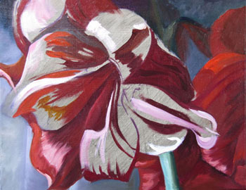
Christmas Amaryllis Times Two


Too many years in the California sunshine has made me feel the cold more than I had predicted. So while I am still learning to pace myself in the New Mexico winters, this week, I painted in the studio. I did two paintings this week. One was 16x20, and a variation on the theme was a tiny 6x6. The Randy Higbee show gave me the idea to try a really small size and see what I could do with a piece I had done in a much larger and slightly different format. I’d love to try and get into that show this next year, if I can tolerate working that small. So this was an effort to see if I liked the results as much in a vastly condensed size.

Amaryllis Source Shot
My yearly amaryllis plants went crazy about a month too soon. They bloomed in November just in time for turkey day rather than waiting for Christmas. While I do not consider myself a floral painter, I love the bright intensely red flowers during the holidays and had planned to paint them alla prima, from life. Because they bloomed so early, when I was not ready to paint them, I took pictures and did them in the studio.


Here you see the really neat setup that my husband fixed for me, a shelf on the left of my easel, so that I can use my computer rather than a printout for reference. At the cost of inks for printers, this should, over time, save a pretty penny. Additionally, I find that monitor  color is not as skewed as is printer color. Here you see the initial drawing and the beginning of the block in of the local color. I like to key in the background first to give me my light and dark working parameters.


I worked fairly quickly, not wanting to over-think this. I wanted the painting to have a sense of immediacy and for the brushwork to remain lively. I had done a lot of composing when I took the pictures. Its easy for a floral to get fussy and overworked. I was trying to not let that happen. This was a totally different approach than the last time I did flowers and glazed magnolias for weeks to get the required depth of form built up. Not quite alla prima, as it took two days, but the smaller one was.

Here you see the color adjustments I made as the painting progressed. I used much more orange than was visible in the photo pf the real flower. It was a very hot red and the highlights were actually a very light lilac.
This is the finished 16x20. It is going to a collector in California. 

Pictured immediately after it, is the 6x6. Tiny, but still full of impact. I actually like it better than the bigger one. I have to figure out why now.  Is it the painting itself, or the format that I like? A square does present its own compostional restrictions. But it is a nice solid shape. The brushwork does seem more prominent in the smaller one. Curious.
Christmas Amaryllis II
6z6 Oil on Prepared Board
Available - email if interested
Its the same shot, but they look radically different. Which do you prefer?


Favorite quote:
 If I could pass anything on to the next generation, it would be to follow your passion, work hard, play, be curious about everything, read a lot, travel, explore, live, love and dig deep. And don't drink cheap wine. 
(Clyde Aspevig)


Friday, December 14, 2012

Inspiration In Old Readings


Do you ever re-read your old art magazines? I confess that I do. In fact last night I was reading a Fall 2011 issue of American Artist-Plein Air Painting. In the issue I was reading there was a great article by James Gurney, on the benefits of using a limited palette, entitled Color and Light in the Landscape.
Remembering not-too-fondly my last time around with this concept, I read through his palette of suggested colors. Guess what? Alizarin crimson was not listed! Here was a list I might actually like! In fact Cad red light was not there either! Here is what he did suggest as a truly pared-down palette:
  • Titanium white (PW 6)
  • Ultramarine blue (PB 29)
  • Yellow ochre (PY 43) (notice no cadmiums here either)
  • Venetian red (PR101) (Can you see me jumping for joy because there is no Aliz crimson here?)

For additional effects such as sunsets, signs, houses and man-made structures he says that adding the following makes all the colors anyone painting the landscape would/should need.
To the above list add the following:
  • Cad yellow light (PY 35)
  • Pyrrole red (PR 254) (now this one is intense and almost as bad as Alizarin crimson for creeping into things)
  • Burnt Sienna (P Br 7)
  • Viridian (PG 18) (talk about a travelling color, this one does too!)
The numbers following the colors are their pigment codes.

Now the idea of a restricted palette and the issues that it banishes from color mixing is one that truly appeals to me. Not to mention I like the idea of not carrying the whole studio along, and the lack of heavy metals from cadmiums is an idea I like as well. But alizarin crimson was not a color I enjoyed as much as one I would engage in, as in combat, say. It just was too unruly, like the kid who was hopped up on sugar. I love the soft effects that a restricted palette gets you, as you are forced to mix colors you might not have mixed before. All hues are related in a restricted palette. It’s like the completely functional family everybody wishes they came from!

I cannot recommend this article by Gurney enough. He continues with a color wheel that he calls the YURMBY wheel. In that wheel he notes the value differences as well as the chroma differences between colors. This is something that almost all color wheels ignore. It was illuminating.

But the thing that made this issue so good, was this Gurney article mated with the article from Maddine Insalaco. Her article was an approach for a quicker way to paint outdoors. It seemed counterproductive, as she mixes her colors on-site, BEFORE she starts to paint and has her palette pre-determined. By doing this, she postpones applying the paint in favor of organization. And I am ignoring the fact that she uses the dreaded A crimson and chromium green (another heavy metal paint). A direct quote from her states “Although the best and most exciting solutions in painting come from experimentation and impulse, good painting ultimately is an alliance between knowledge (intellect) and instinct (feeling).” It smacks of Ken Auster’s Intellect and Passion theory. But I am finding it more true than not. A few judicious minutes spent in organization will provide you with the stage to let fly with the emotional part of painting.

My next time out painting, I intend to try the limited palette that Gurney proposes and Maddine’s systematic approach to mixing the larger body of required colors and allow for some providential inspiration along the way. But today it’s snowing and visibility is super limited. Maybe tomorrow will be a sun on snow day. I am packing my restricted palette. And I am headed into the studio to work on an amaryllis painting that is a studio piece. Should I post it here? It’s not plein air…..who knows?

Favorite quote:
“I don’t run away from a challenge because I am afraid. Instead, I run toward it because the only way to escape fear is to trample it beneath your feet.”              (Nadia Comaneci) – Olympic Gold Medalist

Wednesday, December 12, 2012

Noting the changing seasons


It’s trying to winter up here in southern New Mexico. We have had several mornings of lower than 20 degrees. The land is trying to go to sleep. Most of the color is draining from the plants, but the skies are really interesting. From the HUGE moon we had to the cloud banks and somewhat grey dawns, we are experiencing a change. Even the birds looked cold.
Wind Canyon still has the most engaging play of light across the paling grasses and dusty roads. We had one morning of low valley fog that made the mountain tops look like islands in a sea. But the skies are really noticeable lately. The colors can be intense.

December Morning 11x14
Wind Canyon Etude #10
Oil on prepared board - Available 

One of these chilly mornings, when the sun was putting up a valiant fight to overcome a cloud bank, I grabbed my paints and tried very hard to record the amazing colors. It was a dance between the strong light and the dark sky. Nobody was up walking the canyon, and I saw no one except for those headed to work. It was too cold for anyone to be out unless they had animals to care for. All except for that crazy painter who lives on top of the hill. Did I tell you how my uncle once told me I couldn’t be a painter because everybody knew that they were all crazy? I keep trying to prove to him that I qualify. It was cold out there, and I may have to start wearing extra layers…….TMI.

I have painted this scene before, and I included the truck and wind mill when I last painted it. It was too cold for that nonsense this morning. I got the essentials and think I caught the interplay between both the sun and that threatening front. Today it was a try at getting the values and the color intensity right.
This one is called December Morning. 

Saturday, December 8, 2012

Studio Grand Opening - At Last


I am recuperating from the studio opening we had last weekend.

Viewing area, with comfy couch and good light.
How did it go? I’m glad you asked. It went really well. We had a lot of people for this canyon. Not so many if you compare to other places. But I really believe you have to blossom where you are planted. Painting alongside the road has established an interest in what I was doing. Some people came by because they had seen me over the last year painting Wind Canyon. And we got to meet neighbors we had not known before. A dear friend sent me the loveliest flowers. Thank you, Dianna Ponting. So the studio was cheerful and dust free (as much as I could make it) and staged.

Hubby got the new wall done 2 days before the opening. Gone is the huge roll up door. I can be warm when I paint in the winter now. But I had to wipe down all the dust from the plastering and sanding. It was everywhere. Then we had to move out all the extraneous stuff that is waiting on a shelf or container being built. My new flat paper storing cabinet is not here yet. And we did not get the 2 shelf running bookcase made either. So much of it remains to be relocated when we get those items done. So this stuff was just clutter. It is back, but it made me re-organize which is a good thing.

Main wall with some of my paintings.

I spent a full day making porno pink signs to put along the road. I am not a sign maker. But they were effective, actually pulling people from the highway who would not have stopped otherwise.  I also got the opening in three local magazines. I sent postcards out to those who had expressed an interest in the studio too. And I had put up posters in town for the event at various businesses.
Comments were favorable about both the lovely working space, and my work. I almost sold a painting. But it is hesitant to find a new home. It is still here.
I learned a lot doing this.
  • I needed to have more signs at the other end of the canyon entrance.
  • I needed to do more advertising locally - especially newspapers.
  • I also think I might try a radio spot.
  • There needs to be more posters put up.
  • And I need to do this more than just once.
  • A local painter friend wants to do one with me, and I just might.

So it went well, and I was drained of energy, just from the effort of putting it all up. I sure hope it stays nice and neat for a while. But it is a WORKING studio, and not a glitzy gallery. I am still waiting for that perfect gallery - to the tune of "Someday My Prince Will Come", just substitute gallery. 

Tuesday, December 4, 2012

From Life - Inside

I have been in the studio preparing for its Grand Opening which I will tell you about later.

I have never been able to be in the studio without picking up a brush and starting to paint, even when I am supposed to be moving things about, clearing and cleaning. It did get done, but not until I had set up and started a painting with a great find form my friend Holly's house. Amazing how artists who do still life work peruse their friend's houses always hunting for that unique item to use as a prop.

Fall always gets me in a mood to think about those that came before us, the tools they used and their every day lives. The old butter churn that is central to this piece and the old lamp are two really evocative pieces, to me. Even though Holly owns the churn I begged to borrow it form her and she allowed me to use it. The construction of it is not super old, but how many people do you know who own one?
Set up for Fall Bounty
So before I even was aware, I was setting up the above still life. I love white pumpkins and may have to use them again in another piece before they get yucky. And yes that is a technical term.
Item placement for Fall Bounty
This is how I began this painting, making sure all the elements would fit the 16x20 format.
I have painted the lamp before and was not satisfied with the job I had done and wanted another crack at it.  I was sitting when I painted it so the perspective was a tad different than the photo's. The pumpkins and squash were larger.
Block In for major items in Fall Bounty
This is how I developed the background and major elements. Love those white pumpkins. I had not decided how to tie the right side into the whole yet. It felt empty on the right, and I was puzzling this out as I worked - what did I want there?
Fall Bounty - 16 x 20
Oil Available
Contact me if interested
Indian corn was the answer. A vegetable that was definitely a fall harvest item. I particularly like the lamp. I did a better job on that than I had in the other painting. And the central apple is a good paint application. My painter friend Deb thinks the orange pumpkin is to die for. Isn't it funny how nobody mentions the white pumpkins??